

Graph Generation#
This plugin generates graphs using holoviews during stage 4; any graph type supported by a holoviews backend can be selected with --graphs-backend. Since this plugin uses holoviews to do all the heavy lifting, you may wonder "Why wrap holoviews backends at all?" A wrapper of a wrapper would seem gratuitous at first glance. The reason is that SIERRA's wrapping here enables declarative generation graphs supported by any of the holoviews backends. If you used holoviews directly, you would have to change your python code to use a different backend, as well as to account for subtleties when switching between backends which are not yet ironed out in holoviews. SIERRA's declarative approach here enables you focus on your goal (what type of graph to generate, what you want on it, etc.), rather than the details of how that is implemented.
OS Packages#
apt-get install \
        cm-super \
        texlive-fonts-recommended \
        texlive-latex-extra \
        dvipng
brew install --cask mactex-no-gui
Usage#
This plugin can be selected by adding prod.graphs to the list passed to
--prod. This plugin supports two logical types of graphs, and therefore two
types of analyses:
Intra-experiment graphs, which can be thought of as graphs generated directly from the aggregated data from a set of Experimental Runs.
Inter-experiment graphs, which are generated from a selected subset of data from each Experiment in a Batch Experiment.
Within each of these logical graph types, any --graphs-backend can be specified to generate the actual graphs; overrideable on a per-graph basis. This makes generating mixed e.g. static graphs for inclusion in presentations and interactive graphs for inclusion in webpages easy.
Graph Type |
Use Case Characteristics |
Data Requirements |
|---|---|---|
Linegraph |
|
Each column contains numerical data forming a time series. |
Heatmap |
|
The data has: an X coord column, a Y coord column, and a Z (value) column. |
Confusion Matrix |
The data you want to graph is a set of predicted vs actual category labels. |
The data is contains {truth, predicted} columns. |
Histogram |
|
Each column contains numerical data. |
Scatterplot |
|
The data has an X column and a Y column. The two columns must be the same length (each row is one point). Unlike time series, the points need not be ordered. |
t-SNE |
The datapoints in the data you want to graph have many dimensions, and you want to see ho the data is clustered according to some categorical label. |
Unlike time series, the points need not be ordered. |
Network |
The data you want to graph is a network (graph) of some kind. |
The data is contained in a single GraphML file. |
This plugin can be selected by adding prod.graphs to the list passed to
--prod. When active will create <batchroot>/graphs, and all
graphs generated during stage 4 will accrue under this root directory. Each
experiment will get their own directory in this root for their
statistics. E.g.:
|-- <batchroot>
    |-- graphs
        |-- c1-exp0
        |-- c1-exp1
        |-- c1-exp2
        |-- c1-exp3
        |-- inter-exp
inter-exp/ contains graphs which are generated across experiments in the
batch from Batch Summary Data files.
This plugin requires one of the following stage 3 plugins to have been run:
Statistics Generation (linegraphs, histograms). Without this, no statistics can be included.
Cmdline Interface#
sierra - CLI interface#
sierra [--plot-log-xscale] [--plot-enumerated-xscale] [--plot-log-yscale]
       [--plot-primary-axis PLOT_PRIMARY_AXIS] [--plot-large-text] [--plot-transpose-graphs]
       [--graphs-backend {matplotlib,bokeh}]
       [--exp-n-datapoints-factor EXP_N_DATAPOINTS_FACTOR] [--graphs {intra,inter,all,none}]
       [--graphs-no-LN] [--graphs-no-HM] [--graphs-no-CM] [--graphs-no-HG] [--graphs-no-NW]
       [--graphs-no-SP] [--graphs-no-tSNE] [--graphs-no-RC] [--graphs-no-ROC]
sierra Multi-stage options#
Options which are used in multiple pipeline stages
Place the set of X values used to generate intra- and inter-experiment graphs into the logarithmic space. Mainly useful when the batch criteria involves large system sizes, so that the plots are more readable.
Instead of using the values generated by a given batch criteria for the X values, use an enumerated list[0, ..., len(X value) - 1]. Mainly useful when the batch criteria xticks have a very large numeric range, but only a small set of values within that range, to make plots more readable.
Place the set of Y values used to generate intra - and inter-experiment graphs into the logarithmic space. Mainly useful when the batch criteria xticks have a very large numeric range, so that the plots are more readable.
--plot-primary-axisPLOT_PRIMARY_AXIS-This option allows you to override the primary axis, which is normally is computed based on the batch criteria.
For example, in a bivariate batch criteria composed of
Population Size on the X axis (rows)
Another batch criteria which does not affect system size (columns)
Metrics will be calculated by computing across .csv rows and projecting down the columns by default. Passing a value of 1 to this option will override this calculation, which can be useful in bivariate batch criteria in which you are interested in the effect of the OTHER criteria on various performance measures.
0=criteria of interest varies across rows.
1=criteria of interest varies across columns.
This option only affects generating graphs from bivariate batch criteria.
(default:None)This option specifies that the title, X/Y axis labels/tick labels should be larger than the SIERRA default. This is useful when generating graphs suitable for two column paper format where the default text size for rendered graphs will be too small to see easily. The SIERRA defaults are generally fine for the one column/journal paper format.
Transpose the X, Y axes in generated graphs. Useful as a general way to tweak graphs for best use of space within a paper.
Changed in version 1.2.20: Renamed from
--transpose-graphsto make its relation to other plotting options clearer.
sierra Stage 4 options#
Options for generating products
--graphs-backendGRAPHS_BACKEND-Specify the default backend to be used when generating plots. Can be overriden on a per-graph basis.
matplotlib- Use matplotlib to generate static PNG images.bokeh- Use bokeh to generate stand-alone HTML files containing interactive bokeh visualizations. Files are suitable for inclusion in static webpages, viewing in a browser, etc.
See Graph Generation for more information.
(default:matplotlib)--exp-n-datapoints-factorEXP_N_DATAPOINTS_FACTOR-Specify an additional multiplicative factor for computing the # of datapoints captured duration an Experiment. This is useful if project code has hard-coded down-sampling on experiment length (e.g., it only outputs data every 10 ticks).
(default:1.0)--graphsGRAPHS-Specify which types of graphs should be generated from experimental results:
(default:intra- Generate intra-experiment graphs from the results of a single experiment within a batch, for each experiment in the batch(this can take a long time with large batch experiments). If any intra-experiment models are defined and enabled, those are run and the results placed on appropriate graphs.inter- Generate inter-experiment graphs _across_ the results of all experiments in a batch. These are very fast to generate, regardless of batch experiment size. If any inter-experiment models are defined and enabled, those are run and the results placed on appropriate graphs.all- Generate all types of graphs.none- Skip graph generation.
all)Specify that the linegraphs defined in project YAML configuration should not be generated. Useful if you are working on something which results in the generation of other types of graphs, and the generation of those linegraphs is not currently needed only slows down your development cycle.
Model linegraphs are still generated, if applicable.
Specify that the heatmaps defined in project YAML configuration should not be generated. Useful if you are working on something which results in the generation of other types of graphs, and the generation of heatmaps only slows down your development cycle.
Model heatmaps are still generated, if applicable.
Added in version 1.2.20.
Specify that the intra-experiment confusion matrices defined in project YAML configuration should not be generated. Useful if you are working on something which results in the generation of other types of graphs, and the generation of confusion matrices only slows down your development cycle.
Added in version 1.5.6.
Specify that the histograms defined in project YAML configuration should not be generated. Useful if you are working on something which results in the generation of other types of graphs, and the generation of histograms only slows down your development cycle.
Added in version 1.5.11.
Specify that network graphs the defined in project YAML configuration should not be generated. Useful if you are working on something which results in the generation of other types of graphs, and the generation of network graphs only slows down your development cycle.
Added in version 1.5.11.
Specify that scatterplots defined in project YAML configuration should not be generated. Useful if you are working on something which results in the generation of other types of graphs, and the generation of scatterplots only slows down your development cycle.
Added in version 1.5.12.
Specify that t-SNE graphs defined in project YAML configuration should not be generated. Useful if you are working on something which results in the generation of other types of graphs, and the generation of these plots only slows down your development cycle.
Added in version 1.5.15.
Specify that Risk Coverage Curves defined in project YAML configuration should not be generated. Useful if you are working on something which results in the generation of other types of graphs, and the generation of these plots only slows down your development cycle.
Added in version 1.5.15.
Specify that Receiver Operating Characteristic Curves defined in project YAML configuration should not be generated. Useful if you are working on something which results in the generation of other types of graphs, and the generation of these plots only slows down your development cycle.
Added in version 1.5.15.
Configuration#
This plugin is mostly configured via a graphs.yaml in the Project
config root. The file is structured as follows:
Changed in version 1.5.12: The src_stem and dest_stem keys were renamed to src
and dest (a value may be a path into a subdirectory, so
"stem" was misleading). This is a breaking change: existing
graphs.yaml files must be updated, since unknown keys are
rejected at load time.
intra-exp:
   mycategory1:
     - ...
     - ...
     - ...
 inter-exp:
   mycategory2:
     - ...
     - ...
     - ...
Important
When using the matplotlib backend, SIERRA tells matplotlib to
use LaTeX internally to generate graph labels, titles, etc., so
the standard LaTeX character restrictions within strings apply to
all fields (e.g., '#' is illegal but '\#' is OK). This does not
apply to the bokeh backend, which does not use LaTeX.
Intra-experiment graphs and inter-experiment graphs are configured in their corresponding sections as shown. Within each intra-/inter- experiment graph section is a set of categories, and within each category is list of graphs to generate, specified in a declarative way. Categories can be named anything, and serve two purposes:
A nice way to logically cluster your graphs into related semantic groups.
Act as a filtering mechanism in conjunction with the
controllers.yamlfile to tell SIERRA what graphs to generate for what controllers; it is often the case that you don't want to generate all graphs for all controllers, or that some graphs will crash because of missing data if you try to generate them with a specific controller.
Common Keys#
The following keys are accepted by every graph type, and docs are not repeated in the per-type configuration below.
Key |
Required? |
Meaning |
|---|---|---|
|
Yes |
The path of the source data file, relative to the output directory for an
Experimental Run and without the file extension. It is a path, not
a bare stem: it may name a file in a subdirectory. It is matched
exactly, not as a substring: a bare name ( |
|
No |
The path of the graph to be generated (relative to the graph output
directory, without the extension -- the extension/image type is
determined by the backend). This allows multiple graphs to be generated
from the same data file by plotting different combinations of columns. If
omitted, defaults to |
|
Yes |
Which kind of graph to generate. Must be one of |
|
No |
The title the graph should have. Defaults to |
|
No |
The backend used to render this particular graph. Defaults to --graphs-backend, so individual graphs can opt out of the global choice. |
Note
Configuration is validated against these key sets when it is loaded,
before any graph is generated. An error anywhere in graphs.yaml
is therefore reported up front, and all problems found are reported
together rather than one run at a time.
Intra-Experiment Graphs#
Configuration for each type of intra-experiment graph currently supported by this plugin is below. Unless stated otherwise, all keys are required.
The "stacked" here comes from multiple lines potentially being present (e.g., plotting all columns in a dataframe).
mycategory:
  - src_stem: 'somesubdir/foo'
    dest_stem: 'bar'
    backend: "matplotlib"
    title: 'My Title'

    # The type of graph. Must be  'stacked_line'.
    type: 'stacked_line'

    # List of names of columns within the source file that should be included on
    # the plot. Must match EXACTLY (i.e. no fuzzy matching). Defaults to all
    # columns within the data file if omitted for intra-experiment linegraphs;
    # required for inter-experiment linegraphs.
    cols:
      - 'col1'
      - 'col2'
      - 'col3'
      - '...'


    # List of names of the plotted lines within the graph. Matched pairwise with
    # the selected columns. Defaults to name of each plotted column if omitted.
    legend:
      - 'Column 1'
      - 'Column 2'
      - 'Column 3'
      - '...'

    # The label of the X-axis of the graph. Optional. Defaults to '' if omitted.
    xlabel: 'X'

    # The label of the Y-axis of the graph. Optional. Defaults to '' if omitted.
    ylabel: 'Y'

    # Should the data points be plotted? Defaults to false if omitted.
    points: false

    # Should the y axis scale by logarithmic? Defaults to --plot-log-yscale if
    # omitted (i.e., this option can be overriden on a per-graph basis if
    # desired).
    logy: false
mygraph:
  - src_stem: 'somesubdir/foo'
    dest_stem: 'bar'
    title: 'My Title'
    backend: "matplotlib"

    # The type of graph. Must be 'heatmap'.
    type: 'heatmap'

    # The Z colorbar label to use. Optional. Defaults to '' if omitted.
    zlabel: 'My colorbar label'

    # The X axis label to use. Optional. Defaults to '' if omitted.
    xlabel: 'My X-axis label'

    # The Y axis label to use. Optional. Defaults to '' if omitted.
    ylabel: 'My Y-axis label'

    # The index in the time series to use as the source for heatmap
    # data. -1=last index. Defaults to -1 if omitted.
    index: 14

    # The name of the column containing the X axis values. Defaults to x if
    # omitted.
    x: 'x'

    # The name of the column containing the Y axis values. Defaults to y if
    # omitted.
    y: 'y'

    # The name of the column containing the Z axis values. Defaults to z if
    # omitted.
    z: 'z'
Note
Network graphs read a .graphml file (<src>.graphml
in the experiment's statistics directory) rather than a .csv
like every other graph type, so the file must have been produced
by an earlier stage.
mygraph:
  - src_stem: 'somesubdir/foo'
    dest_stem: 'bar'
    title: 'My Title'
    backend: "matplotlib"

    # The type of graph. Must be 'network'.
    type: 'network'

    # The networkx layout to use for the graph. Valid values are:
    #
    # - spring
    # - spectral
    # - planar
    # - spiral
    # - graphviz_neato
    # - graphviz_dot
    # - bfs
    #
    # All map directly to nx layouts with the exception of graphviz_{dot,neato}
    # which both map to the graphviz layout, using the dot, neato programs for
    # actual layout, respectively.
    #
    # Defaults to "spring" if omitted.
    layout: 'spring'

    # The name of the GraphML node attribute to use to color nodes. If omitted,
    # all nodes will be gray.
    node_color_attr: 'color'

    # The name of the GraphML node attribute to use to determine node size. If
    # omitted, all nodes will be sized according to their degree relative to the
    # min/max for the graph.
    node_size_attr: 'size'

    # The name of the GraphML edge attribute to use to color edges. If omitted,
    # all nodes will be black.
    edge_color_attr: 'color'

    # The name of the GraphML edge attribute to use to weight edge thickness. If
    # omitted, all nodes will be the same thickness.
    edge_weight_attr: 'weight'

    # The name of the GraphML edge label to use. Optional.
    edge_label_attr: 'label'
mygraph:
  - src_stem: 'somesubdir/foo'
    dest_stem: 'bar'
    title: 'My Title'
    backend: "matplotlib"

    # The type of graph. Must be 'confusion_matrix'.
    type: 'confusion_matrix'

    # The column containing ground truth labels. Optional. Defaults to 'truth'
    # if omitted.
    truth_col: 'My truth'

    # The column containing predicted labels. Optional. Defaults to 'predicted'
    # if omitted.
    predicted_col: 'My Predictions'

    # Should the X labels be rotated? Helpful if you have long category
    # names. Defaults to False if omitted.
    xlabels_rotate: False
mycategory:
  - src_stem: 'somesubdir/foo'
    backend: "matplotlib"
    title: 'My Title'
    dest_stem: 'bar'

    # The type of graph. Must be 'histogram'.
    type: 'histogram'

    # List of names of columns within the source file that should be included on
    # the plot. Must match EXACTLY (i.e. no fuzzy matching). Required.
    #
    # For intra-experiment histograms these columns are binned and plotted
    # directly. For inter-experiment histograms these columns are what is
    # extracted from each experiment during collation; the resulting collated
    # file has one column per experiment, and all of them are plotted.
    cols:
      - 'col1'
      - 'col2'
      - 'col3'


    # List of names of the plotted histograms within the graph. Matched pairwise
    # with the selected columns. Defaults to the name of each plotted column if
    # omitted.
    legend:
      - 'Column 1'
      - 'Column 2'
      - 'Column 3'

    # The label of the X-axis of the graph. Optional. Defaults to '' if omitted.
    xlabel: 'X'

    # The label of the Y-axis of the graph. Optional. Defaults to 'Count' if
    # omitted.
    ylabel: 'Count'

    # The number of bins to divide the data into. Optional. If omitted,
    # holoviews chooses a bin count automatically.
    #
    # All plotted columns are binned over a shared range so that bins line up
    # and the distributions are directly comparable.
    bins: 50

    # Supported ways of rendering multiple histograms onto a single plot:
    #
    # - overlay: translucent filled histograms drawn on top of each other. Good
    #   for 2-3 columns; gets muddy beyond that.
    #
    # - steps: outline-only step curves. Scales to many columns without the
    #   visual mud of overlay.
    #
    # - facet: one subplot per column. Not a single set of axes, but the right
    #   choice when columns have very different scales.
    #
    # Defaults to 'overlay' if omitted.
    kind: 'overlay'
A scatterplot of ycol versus xcol, drawn from two columns of the
source file. Optionally overlays a curve of best fit via show_best_fit
and best_fit_kind.
mycategory:
  - src_stem: 'somesubdir/foo'
    backend: "matplotlib"
    title: 'My Title'
    dest_stem: 'bar'

    # The type of graph. Must be 'histogram'.
    type: 'scatterplot'

    # Name of the source column to use for the X values. Defaults to 'xcol' if
    # omitted.
    xcol: myxcol

    # Name of the source column to use for the Y values. Defaults to 'ycol' if
    # omitted.
    ycol: myycol

    # X-axis label. Defaults to 'xcol'.
    xlabel: My X label

    # Y-axis label. Defaults to 'ycol'.
    ylabel: My Y label

    # Whether to overlay a curve of best fit on the scatterplot. Defaults to
    # false.
    show_best_fit: false

    # The kind of fit to overlay when ``show_best_fit`` is ``true``. One of
    # ``linear``, ``quadratic``, ``cubic``, ``log``, or ``exp``. The fitted
    # equation and its R\ :sup:`2` value are appended to the graph title.
    # Ignored when ``show_best_fit`` is ``false``.
    best_fit_kind: linear
Note
R2 is reported for every best_fit_kind, but it is a
meaningful goodness-of-fit measure only for the polynomial kinds
(linear/quadratic/cubic). For log and exp --
which are fit in a transformed space -- treat R2 as a rough
indicator only. A very low R2 on a linear fit usually
means the relationship is not linear, not that the data is meaningless.
Inter-Experiment Graphs#
Configuration for each type of inter-experiment graph currently supported by this plugin is below. Unless stated otherwise, all keys are required.
Note
Inter-experiment graphs collate a single src across
experiments. There is deliberately no way to draw a graph's data from
multiple source files here: by stage 4, any multi-file joining has already
happened upstream in stage 3 (see Intra-Experiment Data Collation, which supports
joining columns from several files into one collated output). A graph that
needs data originally spread across files should point src at the
stage-3 output that already joined them. This keeps every product sourced
from a single file. For how this collation reshapes the data, see
Stage 4 Dataflow and the data-shape note below.
Collated Data Shapes#
During Data Collation, SIERRA reshapes the per-experiment source data into one of two dataframe shapes in the collated output file. Which shape is used is a property of the kind of data, not something you configure -- but knowing which shape a graph type uses helps when inspecting collated CSVs or debugging missing data.
Shape |
Graph Types |
Description |
|---|---|---|
Wide (columnar) |
|
One column per experiment; the column name is the experiment name. This is the natural shape for aligned time-series data that projects already emit, so no reshaping of research output is required. Because every column in a single file must share a height, experiments with shorter series have their columns padded with trailing nulls. |
Long (rowwise) |
|
One row per datapoint, carrying the experiment identity in a column
( |
Important
Missing data (an experiment that ran but produced an empty or
unusable source for a graph) is always recorded as null/absent, never as
a synthesized 0 or -1. A null appears in the collated CSV as an empty
field (,,), which is distinguishable downstream from a genuine
measurement of zero. This matters because any statistic (mean, quartile,
etc.) computed over the collated data would be silently corrupted by a
fabricated zero.
Important
The wide (time-series) collation path assumes that all experiments in a batch share the same starting index/timepoint, so that padding a shorter series with trailing nulls aligns it correctly against the others. Series that start at different x-values would be silently misaligned by this bottom-padding. This assumption holds for the currently supported batch criteria.
The "stacked" here comes from multiple lines potentially being present (e.g., plotting the same column from the same file across all experiments in the batch).
"Nice" X-axis labels are not currently implement for inter-experiment stacked line graphs.
mycategory:
  - src_stem: 'somesubdir/foo'
    dest_stem: 'bar'
    backend: "matplotlib"
    title: 'My Title'

    # The type of graph. Must be  'stacked_line'.
    type: 'stacked_line'

    # List of names of columns within the source file that should be included on
    # the plot. Must match EXACTLY (i.e. no fuzzy matching). Defaults to all
    # columns within the data file if omitted for intra-experiment linegraphs;
    # required for inter-experiment linegraphs.
    cols:
      - 'col1'
      - 'col2'
      - 'col3'
      - '...'


    # List of names of the plotted lines within the graph. Matched pairwise with
    # the selected columns. Defaults to name of each plotted column if omitted.
    legend:
      - 'Column 1'
      - 'Column 2'
      - 'Column 3'
      - '...'

    # The label of the X-axis of the graph. Optional. Defaults to '' if omitted.
    xlabel: 'X'

    # The label of the Y-axis of the graph. Optional. Defaults to '' if omitted.
    ylabel: 'Y'

    # Should the data points be plotted? Defaults to false if omitted.
    points: false

    # Should the y axis scale by logarithmic? Defaults to --plot-log-yscale if
    # omitted (i.e., this option can be overriden on a per-graph basis if
    # desired).
    logy: false
The "summary" here comes from the selection of a single point from a time series of interest for each experiment in the batch. For example, if you took the last point of some measure of interest, that might summarize steady-state behavior.
mycategory:
  - src_stem: 'somesubdir/foo'
    dest_stem: 'bar'
    title: 'My Title'
    backend: "matplotlib"

    # The type of graph. Must be 'summary_line'.
    type: 'summary_line'

    # List of names of the column within the source file that should be included
    # on the plot. Must match EXACTLY (i.e. no fuzzy matching).
    col: 'col1'

    # List of names of the plotted lines within the graph. Matched pairwise with
    # the selected columns. Defaults to name of each plotted column if omitted.
    legend:
      - 'Column 1'
      - 'Column 2'
      - 'Column 3'
      - '...'

    # The index in the time series to use as the source for linegraph
    # data. -1=last index. Defaults to -1 if omitted.
    index: 14

    # The label of the X-axis of the graph. Optional. Defaults to '' if omitted.
    xlabel: 'X'

    # The label of the Y-axis of the graph. Optional. Defaults to '' if omitted.
    ylabel: 'Y'

    # Should the data points be plotted? Defaults to false if omitted.
    points: false

    # Should the y axis scale by logarithmic? Defaults to --plot-log-yscale if
    # omitted (i.e., this option can be overriden on a per-graph basis if
    # desired).
    logy: false
A 2D heatmap of data, drawn from a specified per-experiment time series (e.g., if you took the last point of some measure of interest, that might summarize steady-state behavior).
The xlabel and ylabel fields are drawn from the current bivariate
batch criteria, along with the x/y ticks.
mygraph:
  - src_stem: 'somesubdir/foo'
    dest_stem: 'bar'
    title: 'My Title'
    backend: "matplotlib"

    # The type of graph. Must be 'heatmap'.
    type: 'heatmap'

    # The Z colorbar label to use. Optional. Defaults to '' if omitted.
    zlabel: 'My colorbar label'

    # The X axis label to use. Optional. Defaults to '' if omitted.
    xlabel: 'My X-axis label'

    # The Y axis label to use. Optional. Defaults to '' if omitted.
    ylabel: 'My Y-axis label'

    # The index in the time series to use as the source for heatmap
    # data. -1=last index. Defaults to -1 if omitted.
    index: 14

    # The name of the column containing the X axis values. Defaults to x if
    # omitted.
    x: 'x'

    # The name of the column containing the Y axis values. Defaults to y if
    # omitted.
    y: 'y'

    # The name of the column containing the Z axis values. Defaults to z if
    # omitted.
    z: 'z'
A set of histograms with various rendering options. Can render numerical or categorical data.
Important
For inter-experiment histograms cols must name
exactly one column. That column is extracted from every
experiment in the batch during Data Collation, so
the collated file has one column per experiment; all of
those columns are then plotted together. Naming more than
one column is an error.
For intra-experiment histograms cols may name any
number of columns, all of which are plotted.
mycategory:
  - src_stem: 'somesubdir/foo'
    backend: "matplotlib"
    title: 'My Title'
    dest_stem: 'bar'

    # The type of graph. Must be 'histogram'.
    type: 'histogram'

    # List of names of columns within the source file that should be included on
    # the plot. Must match EXACTLY (i.e. no fuzzy matching). Required.
    #
    # For intra-experiment histograms these columns are binned and plotted
    # directly. For inter-experiment histograms these columns are what is
    # extracted from each experiment during collation; the resulting collated
    # file has one column per experiment, and all of them are plotted.
    cols:
      - 'col1'
      - 'col2'
      - 'col3'


    # List of names of the plotted histograms within the graph. Matched pairwise
    # with the selected columns. Defaults to the name of each plotted column if
    # omitted.
    legend:
      - 'Column 1'
      - 'Column 2'
      - 'Column 3'

    # The label of the X-axis of the graph. Optional. Defaults to '' if omitted.
    xlabel: 'X'

    # The label of the Y-axis of the graph. Optional. Defaults to 'Count' if
    # omitted.
    ylabel: 'Count'

    # The number of bins to divide the data into. Optional. If omitted,
    # holoviews chooses a bin count automatically.
    #
    # All plotted columns are binned over a shared range so that bins line up
    # and the distributions are directly comparable.
    bins: 50

    # Supported ways of rendering multiple histograms onto a single plot:
    #
    # - overlay: translucent filled histograms drawn on top of each other. Good
    #   for 2-3 columns; gets muddy beyond that.
    #
    # - steps: outline-only step curves. Scales to many columns without the
    #   visual mud of overlay.
    #
    # - facet: one subplot per column. Not a single set of axes, but the right
    #   choice when columns have very different scales.
    #
    # Defaults to 'overlay' if omitted.
    kind: 'overlay'
For inter-experiment scatterplots, the xcol and ycol columns are
extracted from every experiment in the batch during Data
Collation and pooled into a single long-format frame (see
Collated Data Shapes). Each experiment contributes its
own set of (x, y) points; experiments with different numbers of points are
handled without padding. All pooled points are then plotted together, so a
single scatterplot shows the (x, y) relationship across the whole batch.
mycategory:
  - src_stem: 'somesubdir/foo'
    backend: "matplotlib"
    title: 'My Title'
    dest_stem: 'bar'

    # The type of graph. Must be 'histogram'.
    type: 'scatterplot'

    # Name of the source column to use for the X values. Defaults to 'xcol' if
    # omitted.
    xcol: myxcol

    # Name of the source column to use for the Y values. Defaults to 'ycol' if
    # omitted.
    ycol: myycol

    # X-axis label. Defaults to 'xcol'.
    xlabel: My X label

    # Y-axis label. Defaults to 'ycol'.
    ylabel: My Y label

    # Whether to overlay a curve of best fit on the scatterplot. Defaults to
    # false.
    show_best_fit: false

    # The kind of fit to overlay when ``show_best_fit`` is ``true``. One of
    # ``linear``, ``quadratic``, ``cubic``, ``log``, or ``exp``. The fitted
    # equation and its R\ :sup:`2` value are appended to the graph title.
    # Ignored when ``show_best_fit`` is ``false``.
    best_fit_kind: linear
Note
If the batch criteria has dimension > 1, inter-experiment linegraphs and histograms are disabled/ignored currently. This will hopefully be fixed in a future version of SIERRA. (SIERRA#357).
Linegraph Examples#
For these examples, we will use the following SIERRA cmd and YAML configuration from the ARGoS sample project.
sierra \
  --sierra-root=~/test \
  --controller=foraging.footbot_foraging \
  --engine=engine.argos \
  --project=projects.sample_argos \
  --exp-setup=exp_setup.T1000.K5 \
  --n-runs=4 \
  --physics-n-engines=1 \
  --expdef-template=~/git/sierra-sample-project/exp/argos/template.argos \
  --scenario=LowBlockCount.10x10x2 \
  --with-robot-leds \
  --with-robot-rab \
  --controller=foraging.footbot_foraging \
  --batch-criteria population_size.Linear5.C5 \
  --exp-n-datapoints-factor=0.1 \
  --spread=none
intra-exp:
  LN_default:
    - src: collected-data
      dest: robot-counts
      cols:
        - walking
        - resting
      title: 'Robot Counts'
      legend:
        - 'Walking'
        - 'Resting'

      xlabel: 'Time'
      ylabel: '\# Robots'
      type: 'stacked_line'

    - src: collected-data
      dest: food-counts
      cols:
        - collected_food
      title: 'Collected Food Counts'
      legend:
        - ''

      xlabel: 'Time'
      ylabel: '\# Items'
      type: 'stacked_line'

    - src: collected-data
      dest: swarm-energy
      cols:
        - energy
      title: 'Swarm Energy Over Time'
      legend:
        - ''

      xlabel: 'Time'
      type: 'stacked_line'
Intra-Experiment#
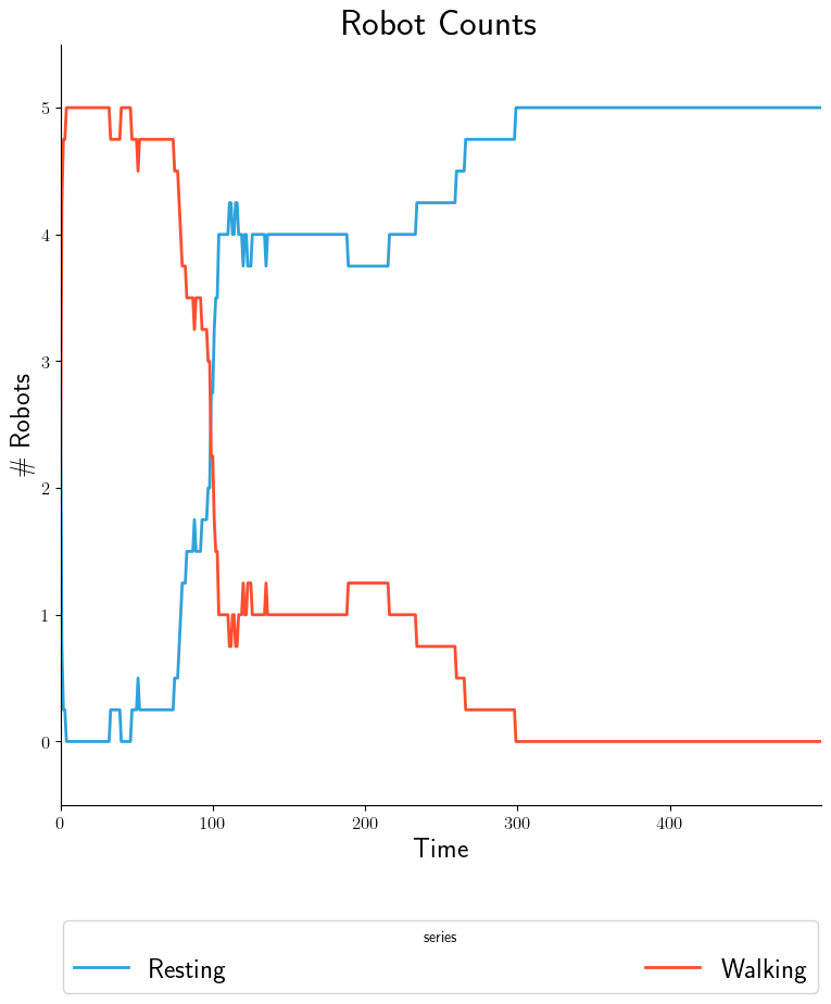
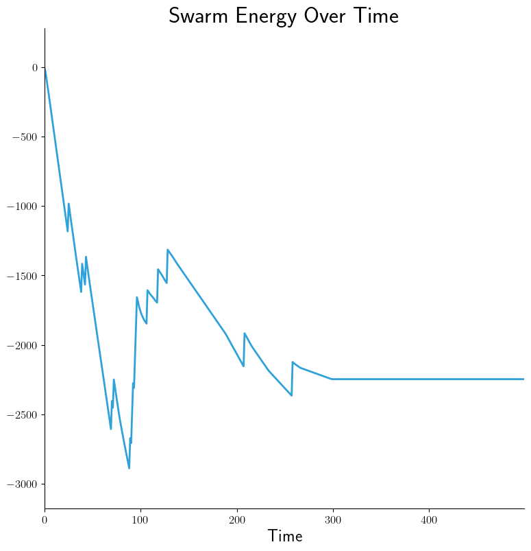
As mentioned earlier, intra-experiment products are time-series based and
generated from processed data within each experiment. Using the above command
and .yaml configuration capabilities we can generate graphs easily with
--graphs-backend=matplotlib, OR interactive widgets with
--graphs-backend=bokeh:

|
|
|
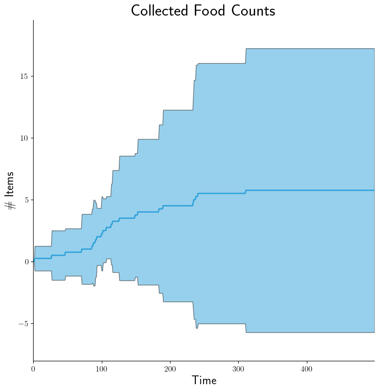
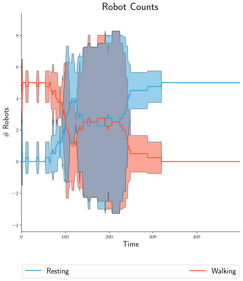
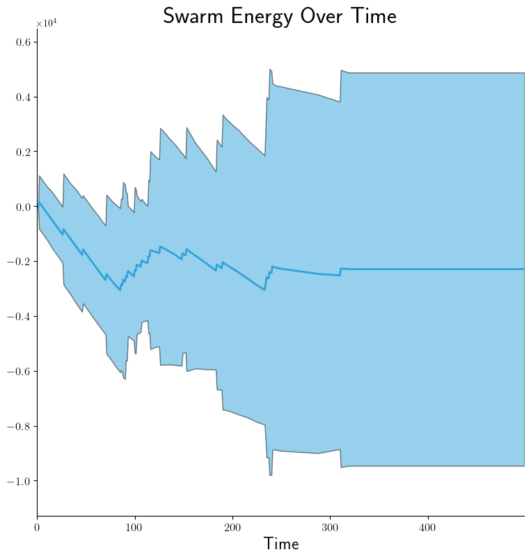
If we then want to plot 95% confidence intervals by doing --spread=conf95<src/plugins/proc/statistics:sierra---spread:
|
|
|
Same idea for box-and-whisker plots via --spread=bw<src/plugins/proc/statistics:sierra---spread (not shown). Now suppose we want the walking/resting counts to appear on separate graphs. YAML configuration becomes:
- src: collected-data
  dest: robot-counts
  cols:
    - walking
  title: 'Robot Counts'
  legend:
    - 'Walking'

- src: collected-data
  dest: robot-counts
  cols:
    - resting
  title: 'Robot Counts'
  legend:
    - 'Resting'
It's really that easy!
Inter-Experiment#
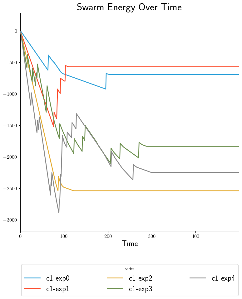
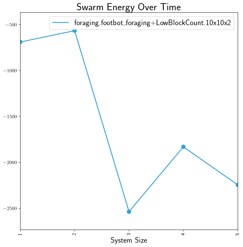
After stage 3, some data is in Processed Output Data files. In stage 4, we can run Data Collation on either of these types of files in order to further refine their contents but at the level of a experiments within a batch rather than experimental runs within an experiment. After collation, inter-experiment products can be generated directly. These products can be time-based, showing results from each experiment. Compare the two graphs, each representing the same data: a measurement of swarm energy over time. The graph on the right is arguably more readable because it summarizes the steady-state information more clearly.
|
|
For the summary graph, the X-axis labels are populated based on the Batch Criteria used. Obviously, this is for a single batch experiment; summary graphs for multiple batch experiments can be combined in stage 5. See Graph Comparison for info.
Confusion Matrix Examples#
For these examples, we will use the following SIERRA cmd and YAML configuration from the YAMLSIM sample project
sierra \
   --sierra-root=~/test \
   --controller=default.default \
   --engine=plugins.yamlsim \
   --project=projects.sample_yamlsim \
   --n-runs=4 \
   --expdef-template=~/git/sierra-sample-project/exp/yamlsim/template.yaml \
   --scenario=scenario1 \
   --expdef=expdef.yaml \
   --yamlsim-path=~/git/sierra-sample-project/plugins/yamlsim/yamlsim.py \
   --proc proc.statistics proc.collate \
   --controller=default.default \
   --batch-criteria noise_floor.1.9.C5 \
   --pipeline 1 2 3 4
intra-exp:
  CM_default:
    - src: confusion-matrix
      dest: confusion-matrix
      type: "confusion_matrix"
      title: "I'm A Little Confused"
      truthcol: Actual_Class
      predcol: Predicted_Class
Intra-Experiment#
In addition to time-series based outputs, projects can also output
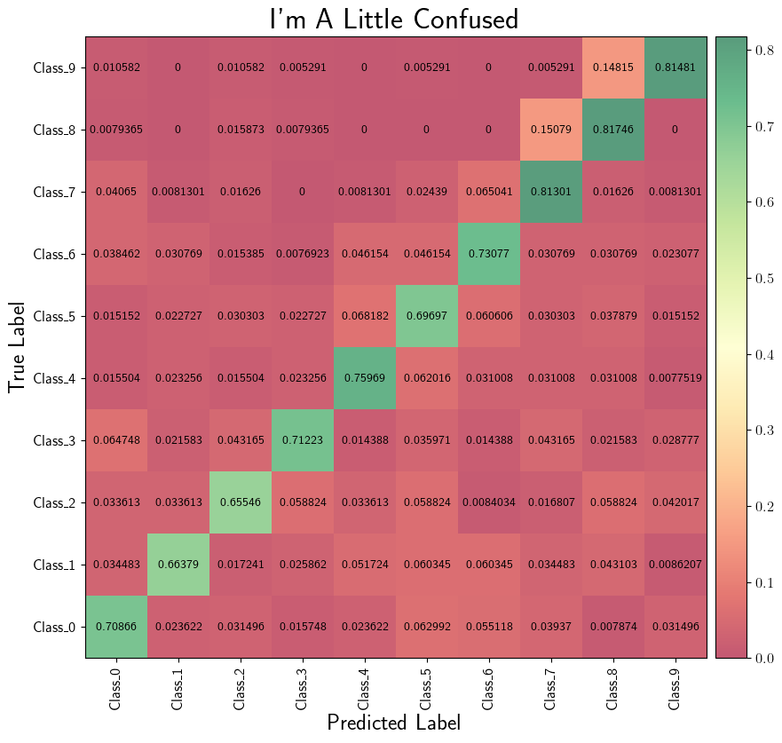
classification data in terms of predicted vs actual labels. These can be
combined into confusion matrices within each experiment to give a nice summary
of performance. Using the above command and .yaml configuration capabilities
we can generate graphs easily with --graphs-backend=matplotlib, OR
interactive widgets with --graphs-backend=bokeh:
|
Histogram Examples#
For these examples, we will use the following SIERRA cmd and YAML configuration from the YAMLSIM sample project
sierra \
   --sierra-root=~/test \
   --controller=default.default \
   --engine=plugins.yamlsim \
   --project=projects.sample_yamlsim \
   --n-runs=4 \
   --expdef-template=~/git/sierra-sample-project/exp/yamlsim/template.yaml \
   --scenario=scenario1 \
   --expdef=expdef.yaml \
   --yamlsim-path=~/git/sierra-sample-project/plugins/yamlsim/yamlsim.py \
   --proc proc.statistics proc.collate \
   --controller=default.default \
   --batch-criteria noise_floor.1.9.C5 \
   --pipeline 1 2 3 4
intra-exp:
  HG_default:
    - src: entropy-data
      dest: entropy-data
      type: "histogram"
      kind: "overlay"
      title: "Entropy comparison"
      cols:
        - entropy0
        - entropy1
        - entropy2
      bins: 50
Using the above command and .yaml configuration capabilities we can generate
graphs easily with --graphs-backend=matplotlib, OR interactive widgets with
--graphs-backend=bokeh. Different kinds of histograms can be generated with
the kind option.
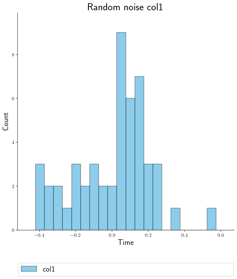
Histogram from one experiment. |
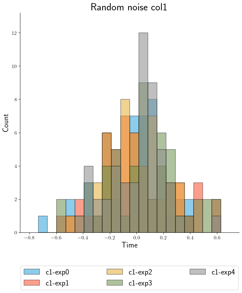
Overlay histogram across all experiments. |
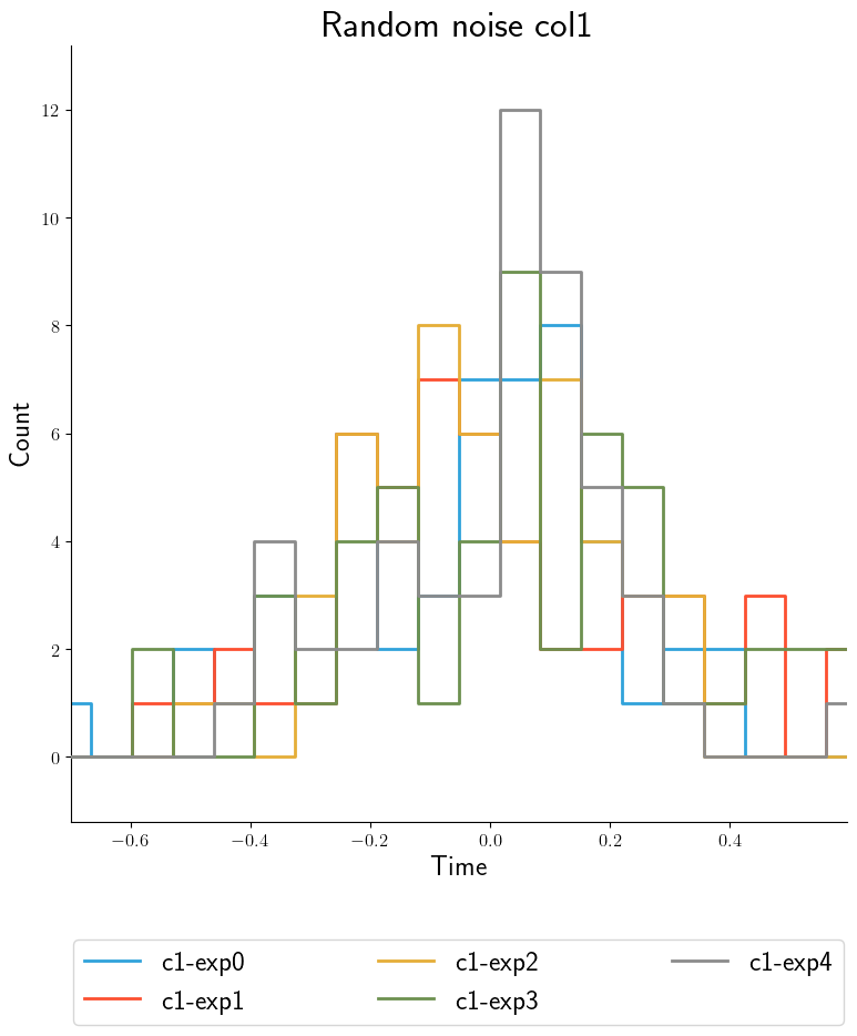
Step histogram across all experiments. |
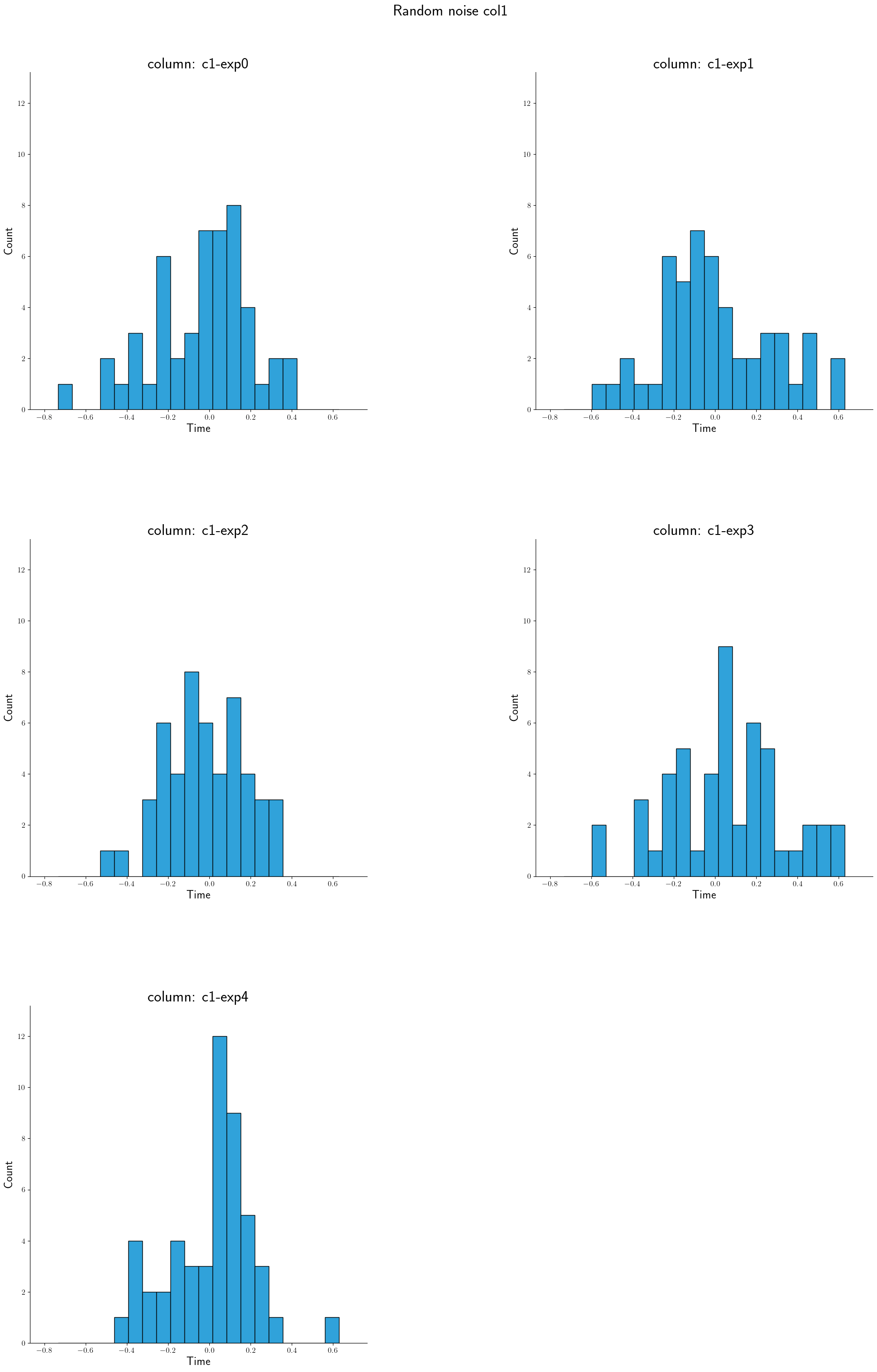
Facet histogram across all experiments. |
Scatterplot Examples#
For these examples, we will use the following SIERRA cmd and YAML configuration from the JSONSIM sample project.
sierra \
   --sierra-root=~/test \
   --controller=default.default \
   --engine=plugins.jsonsim \
   --project=projects.sample_jsonsim \
   --n-runs=4 \
   --expdef-template=~/git/sierra-sample-project/exp/jsonsim/template.json \
   --scenario=scenario1 \
   --expdef=expdef.json \
   --jsonsim-path=~/git/sierra-sample-project/plugins/jsonsim/jsonsim.py \
   --proc proc.statistics proc.collate \
   --controller=default.default \
   --batch-criteria max_speed.1.9.C5 \
   --pipeline 1 2 3 4
intra-exp:
  SP_default:
    - src: subdir3/output1D
      dest: noise-vs-noise-fit
      type: "scatterplot"
      title: "Batch Accuracy vs V-Score"
      xcol: batch_accuracy_percent
      ycol: batch_vscore
      xlabel: "Batch Accuracy Percent"
      ylabel: "Batch V-Score"
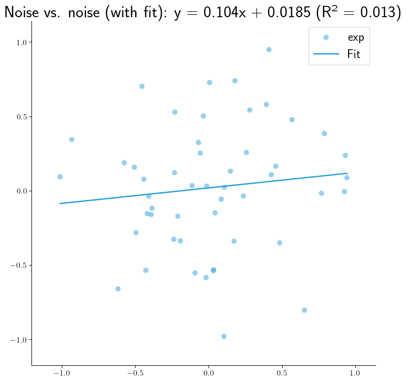
      show_best_fit: true
      best_fit_kind: "linear"
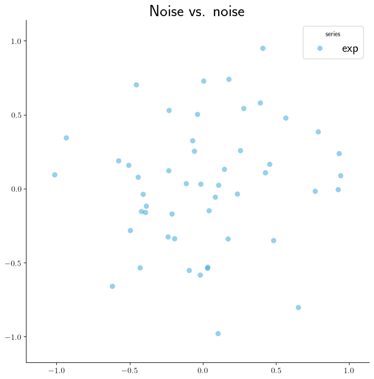
A scatterplot of two columns from a single experiment's data, optionally with a
line of best fit. Generate static images with --graphs-backend=matplotlib or
interactive widgets with --graphs-backend=bokeh:
|
|
t-SNE Plot Examples#
For these examples, we will use the following SIERRA cmd and YAML configuration from the YAMLSIM sample project
sierra \
   --sierra-root=~/test \
   --controller=default.default \
   --engine=plugins.yamlsim \
   --project=projects.sample_yamlsim \
   --n-runs=4 \
   --expdef-template=~/git/sierra-sample-project/exp/yamlsim/template.yaml \
   --scenario=scenario1 \
   --expdef=expdef.yaml \
   --yamlsim-path=~/git/sierra-sample-project/plugins/yamlsim/yamlsim.py \
   --proc proc.statistics proc.collate \
   --controller=default.default \
   --batch-criteria noise_floor.1.9.C5 \
   --pipeline 1 2 3 4
intra-exp:
  TSNE_default:
    - src: alg-behavior
       dest: alg-behavior-intra
       vcols:
         - throughput
         - latency
         - energy
         - path_eff
         - collisions
         - coverage
         - convergence
         - load_balance
       labelcol: controller
       type: tSNE
A t-SNE of from a single experiment's data. Generate static images with
--graphs-backend=matplotlib or interactive widgets with
--graphs-backend=bokeh: